Prox.ia
Team
Lead Designer: Marie Fiorucci
UX Designer: François Brousse
Freelance – 2025
Context & Audience
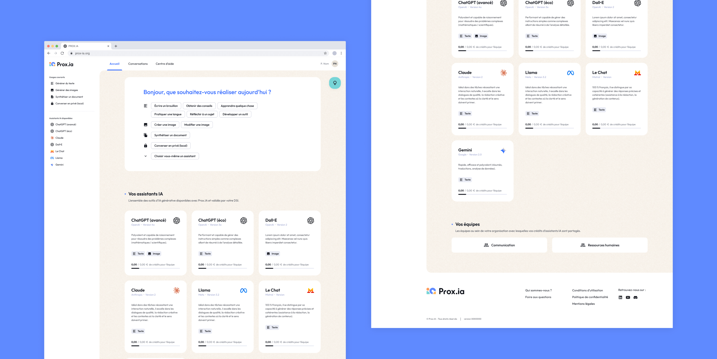
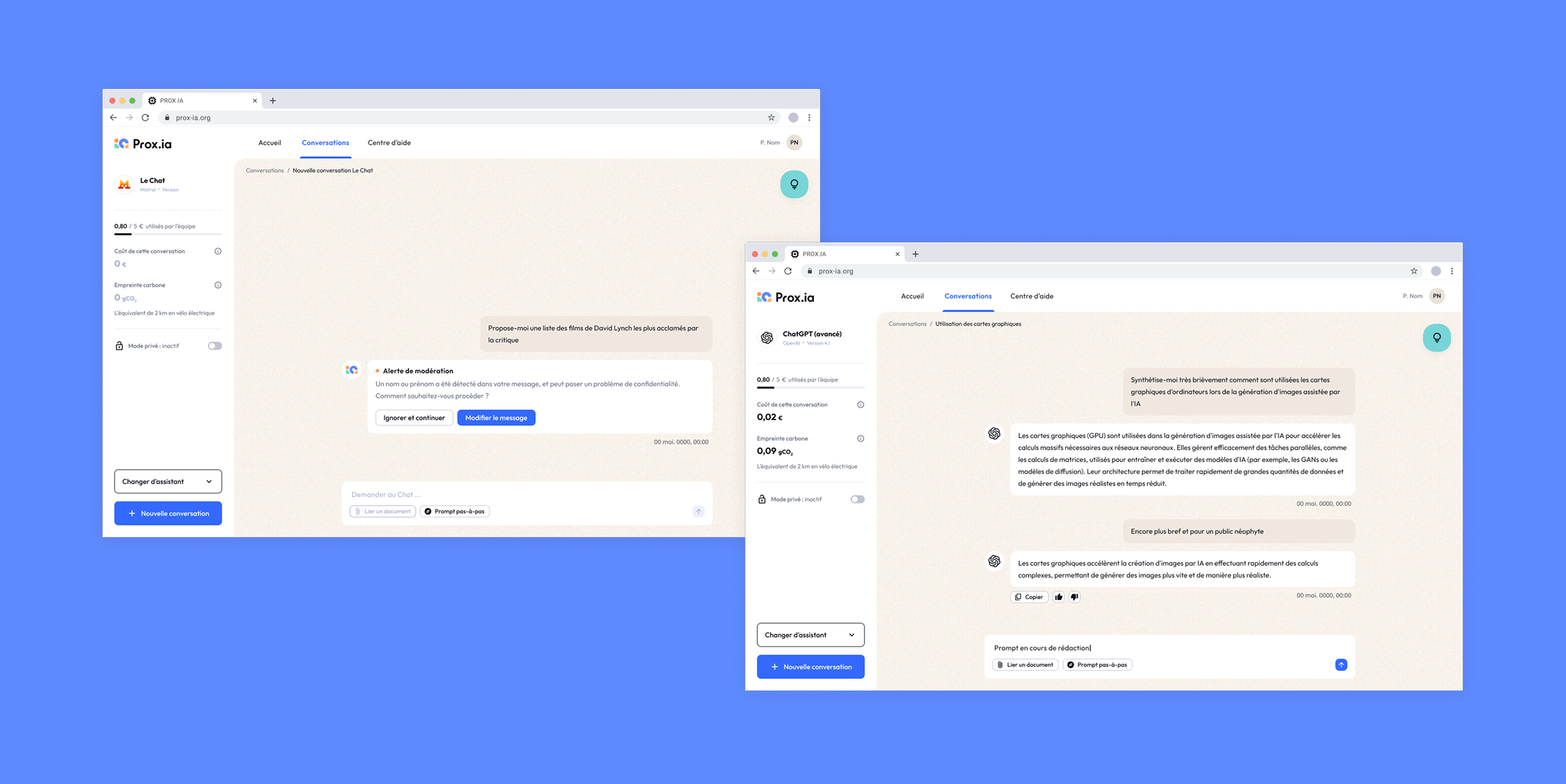
Prox.ia is an AI tool aggregator developed in France, launched in May 2025 as a market test to assess demand and validate its potential for further development. Aimed at government administrations and local community organisations, Prox.ia provides secure, shared access to a wide range of AI tools—including ChatGPT, Claude, Gemini, DALL·E, and more—under a single affordable subscription. The platform enhances digital inclusion by simplifying access, reinforcing security, offering individual usage tracking, and including educational features like tool guidance, feedback prompts, and alerts to help users make the most of AI.
The platform is designed for individuals who are not AI-savvy and need support to understand what is possible with different AI tools, how to prompt effectively, and how to use these technologies with confidence and purpose.
Design Challenge
The brief was to create a logo and propose an art direction for the user interface of the platform. With just six days allocated to this initial project phase, the objective was to set a strong visual foundation while allowing flexibility for future iterations. As the brand name may evolve, the logo needed to remain functional and relevant even in the event of a name change.
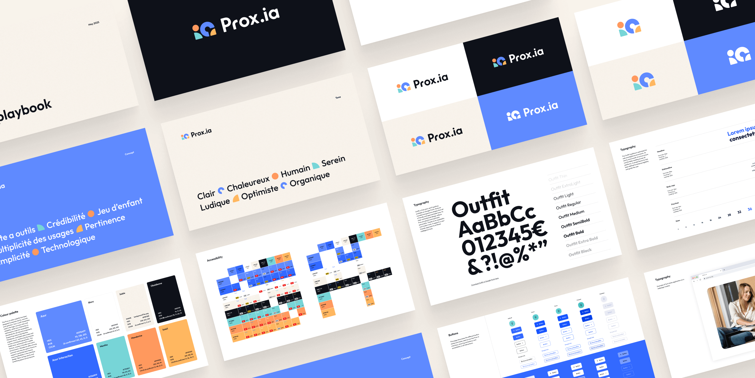
Logo, Fonts & Colours
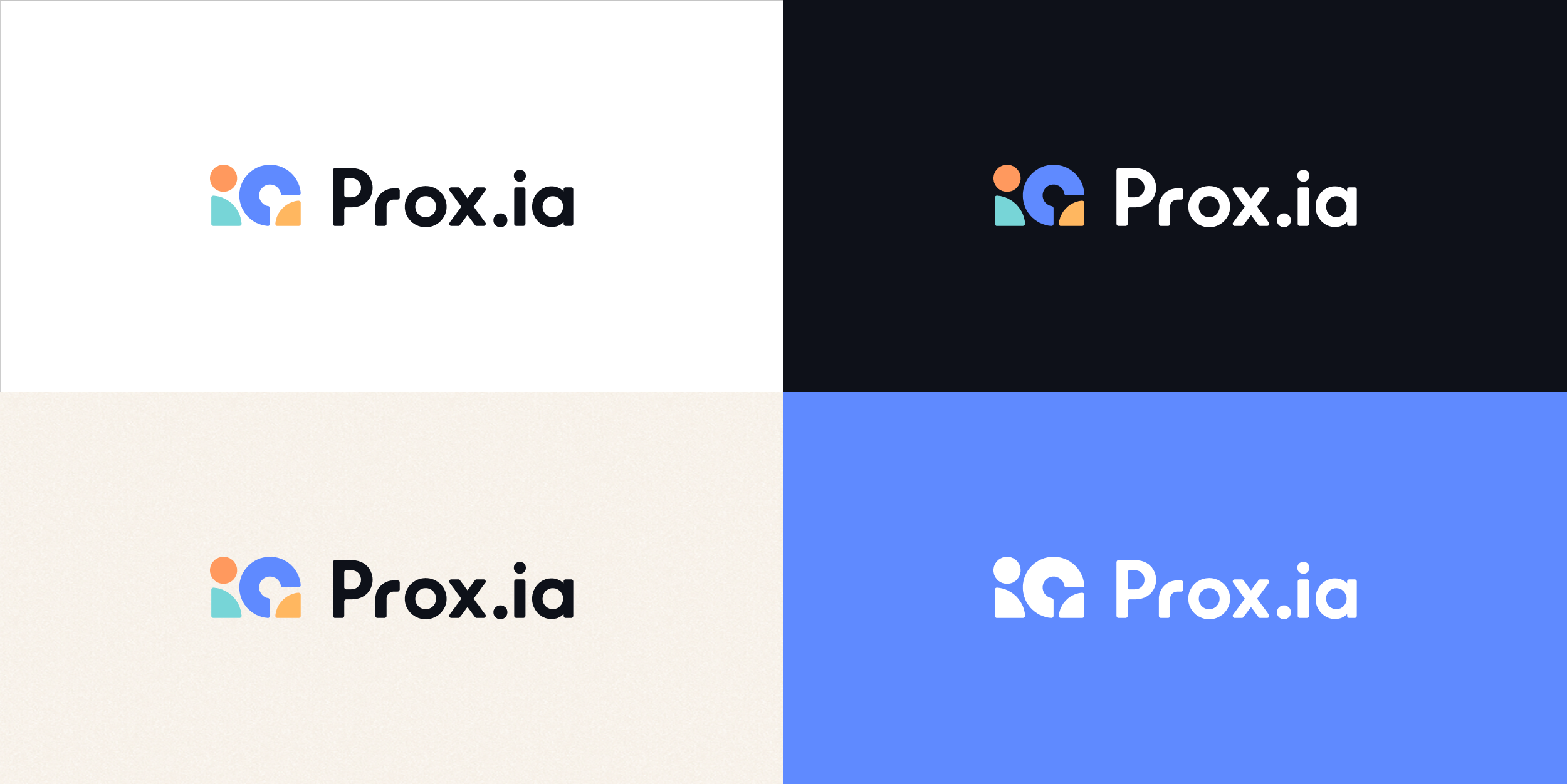
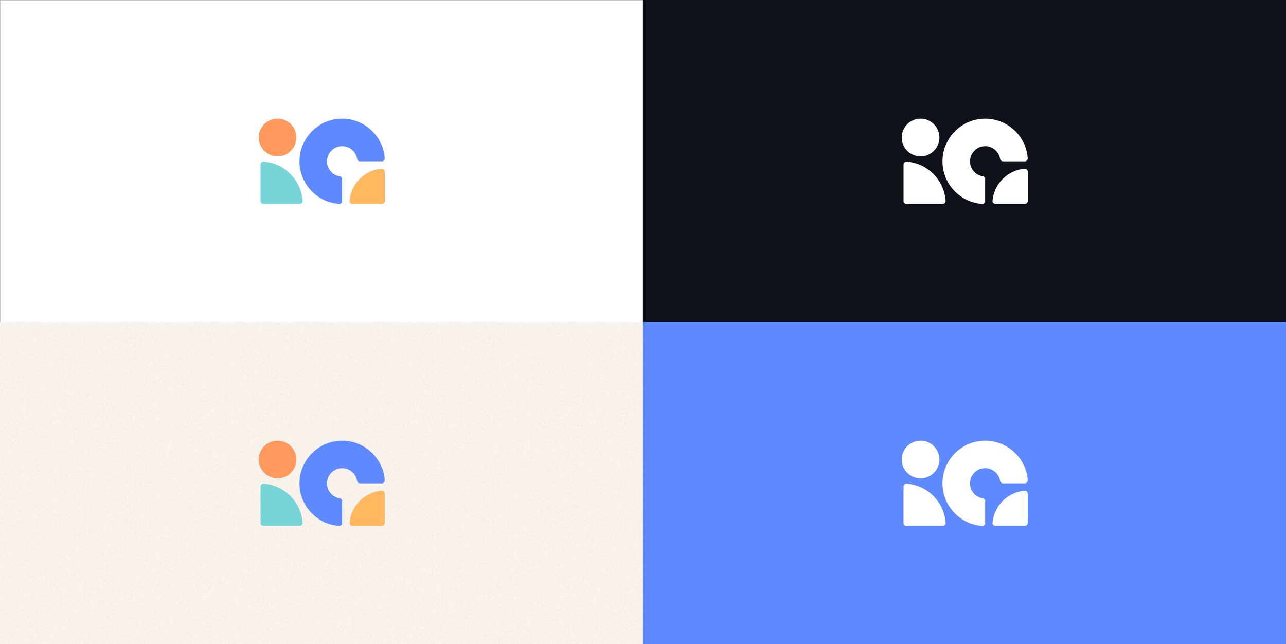
Keeping in mind that the audience is new to AI, the logo was created around the concept of a simple “boîte à outils” — an AI toolbox offering clarity and practical utility. With Prox.ia, using AI should feel as easy and intuitive as child’s play. The logo combines rounded shapes and vibrant colours to create a warm, approachable identity that reassures rather than intimidates. The simple, colourful, and playful composition deliberately contrasts with the cold, technical aesthetic commonly found in AI branding, which can feel overwhelming or exclusive. Instead, Prox.ia embraces a light, human, and joyful tone that aligns with its mission to democratise access to artificial intelligence.
The reference to "ia" (AI in french) in the logo reinforces the platform’s core service, while maintaining the flexibility to evolve should the name change in future.
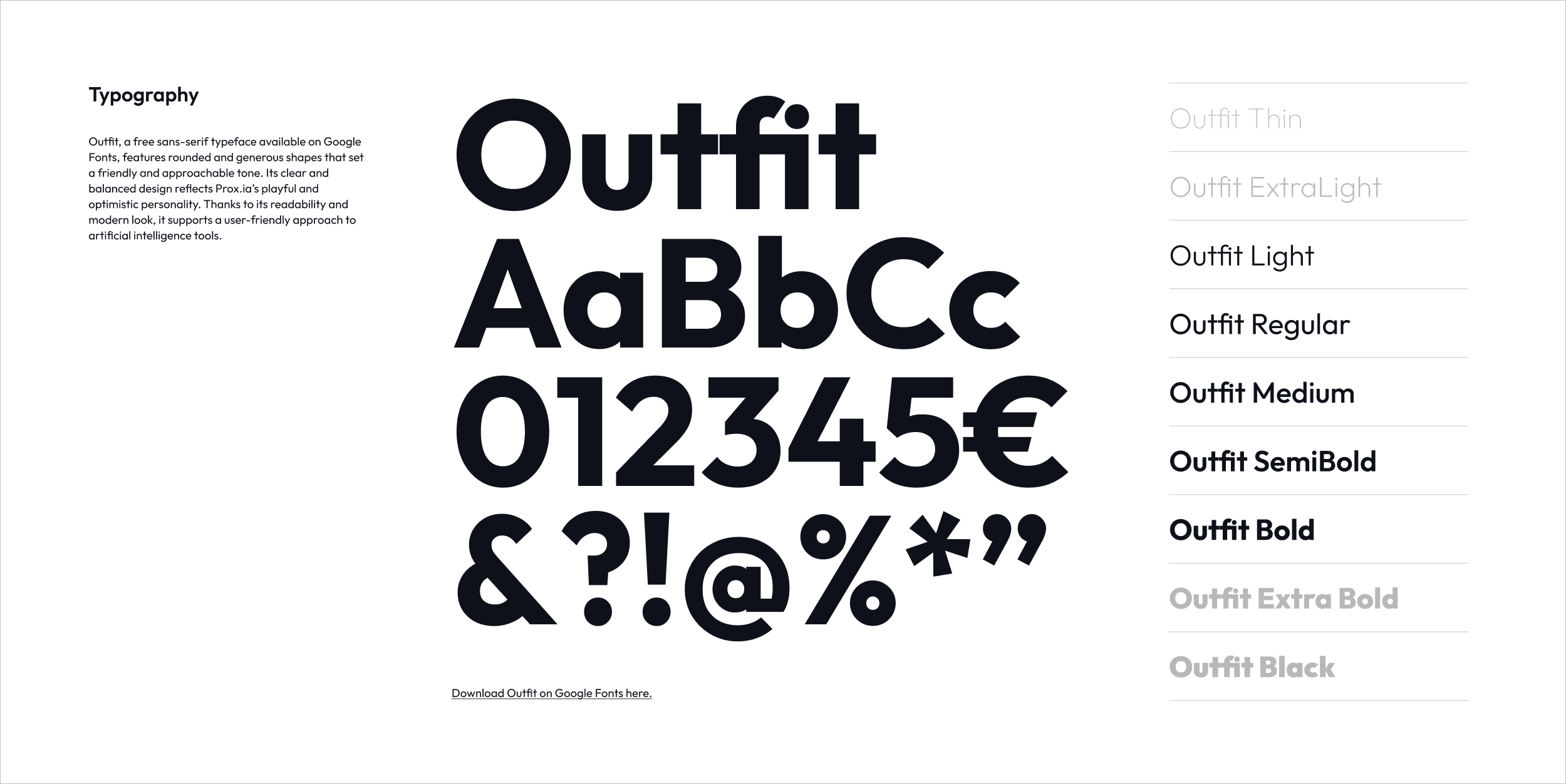
The chosen typeface, Outfit, is a free Google Font selected for its soft, rounded geometry that conveys a welcoming and modern tone, ideal for digital environments.
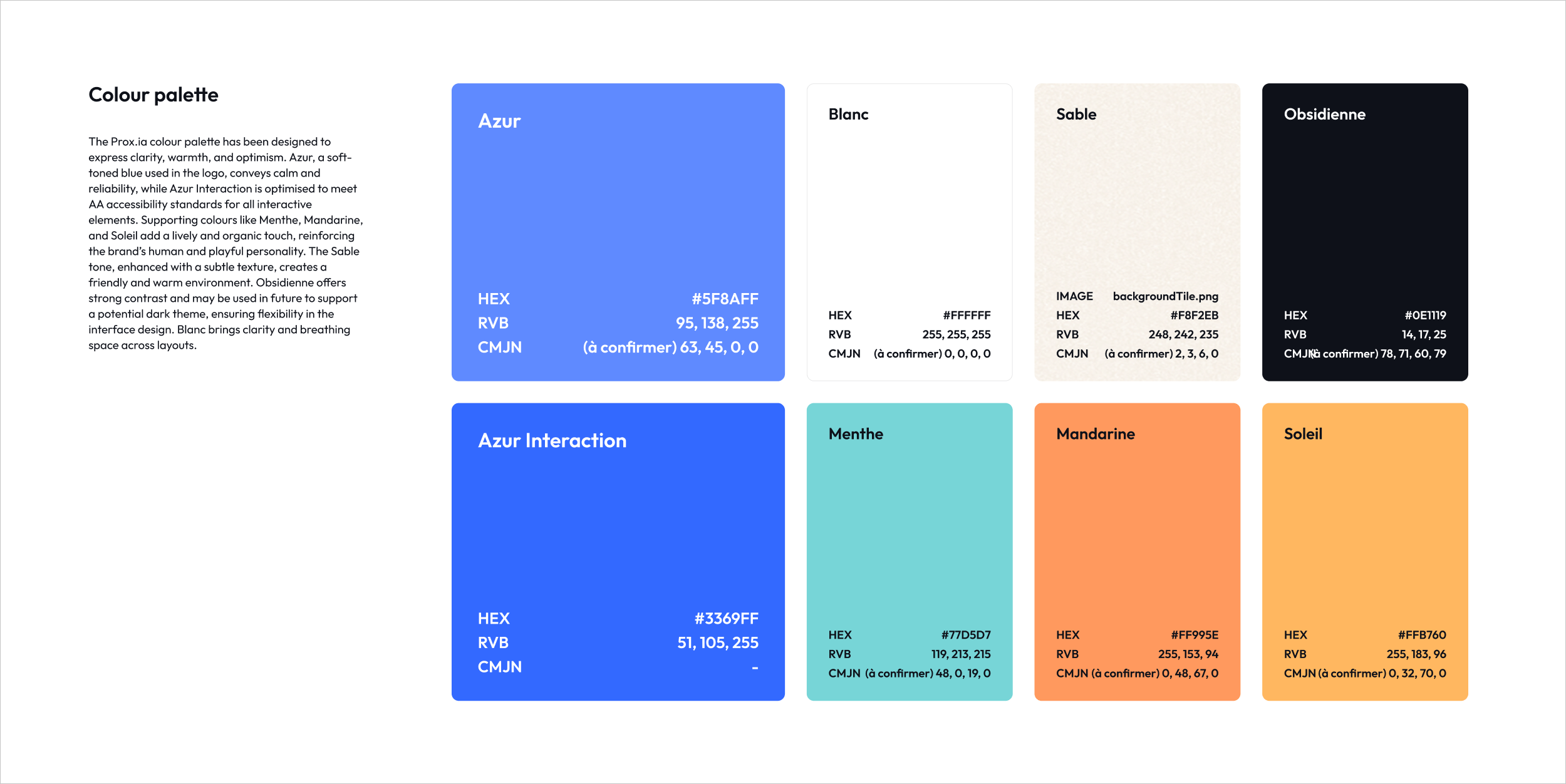
The colour palette centres around Azur, a calm and optimistic blue used in the logo, complemented by Azur Interaction, which meets AA accessibility standards for interactive elements. Accent colours like Menthe, Mandarine, and Soleil introduce warmth and vitality, while Sable—with its subtle texture—creates a friendly, grounded backdrop. Obsidienne is reserved for future use in potential dark mode interfaces.
Interface Look & Feel
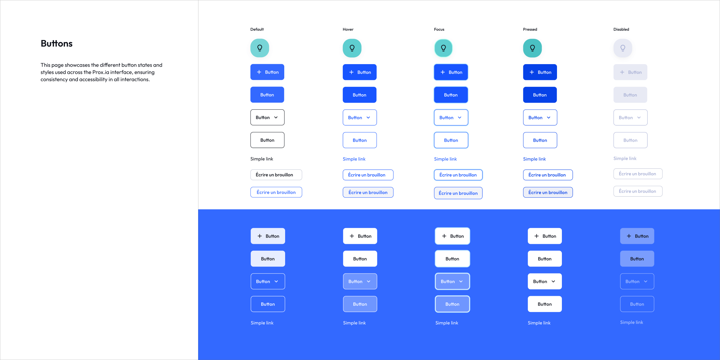
The proposed interface direction balances functionality and approachability, supporting Prox.ia’s mission to demystify AI for broader public use. Buttons, typography, and layout follow accessible, scalable design principles, with particular attention to clear hierarchy, generous spacing, and intuitive navigation.
The use of visual cues, such as icons and contextual colour changes, enhances user guidance and confidence when navigating multiple tools within the platform. The rollout of the screens and final implementation has been handled by the internal team.