Superhero
– Website
Team
Design Director and Lead UX-UI Designer: Marie Fiorucci
Strategist: Ken Chan & Caitlin Spence
Executive Creative Director: Reece Ryan
Agency: Hardhat – 2023
Context
Superhero, a leading trading app in Australia's financial technology sector, needs a comprehensive redesign for both its identity and website. The website's design fails to capture the innovation and user-friendly experience synonymous with the Superhero app. It falls short of effectively differentiating the brand from its competitors and lacks resonance with the expanding audience that has grown over the past few years. Furthermore, the current website structure lacks the flexibility needed to showcase the new superannuation product line alongside its existing offerings.
Design Challenge
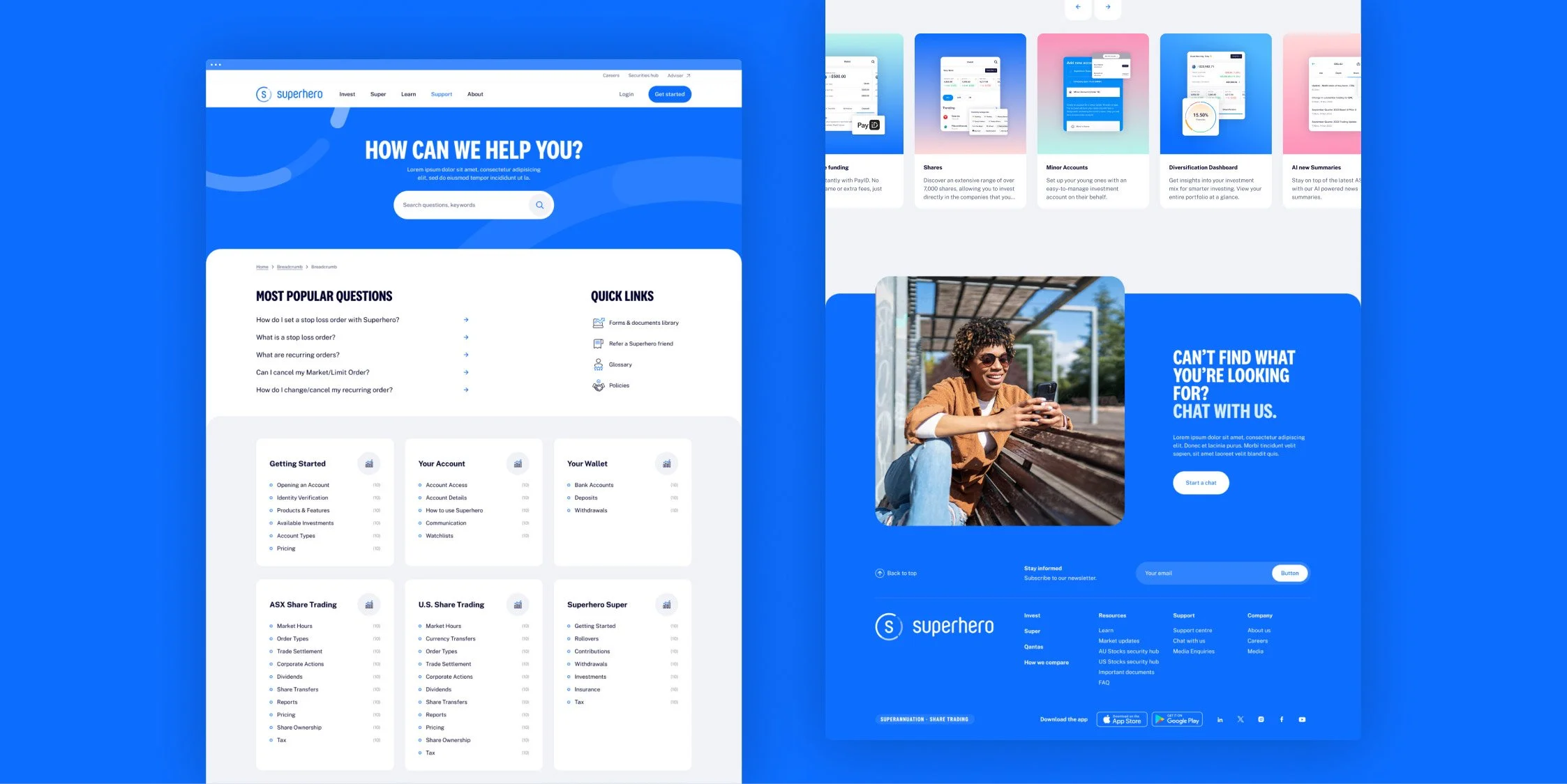
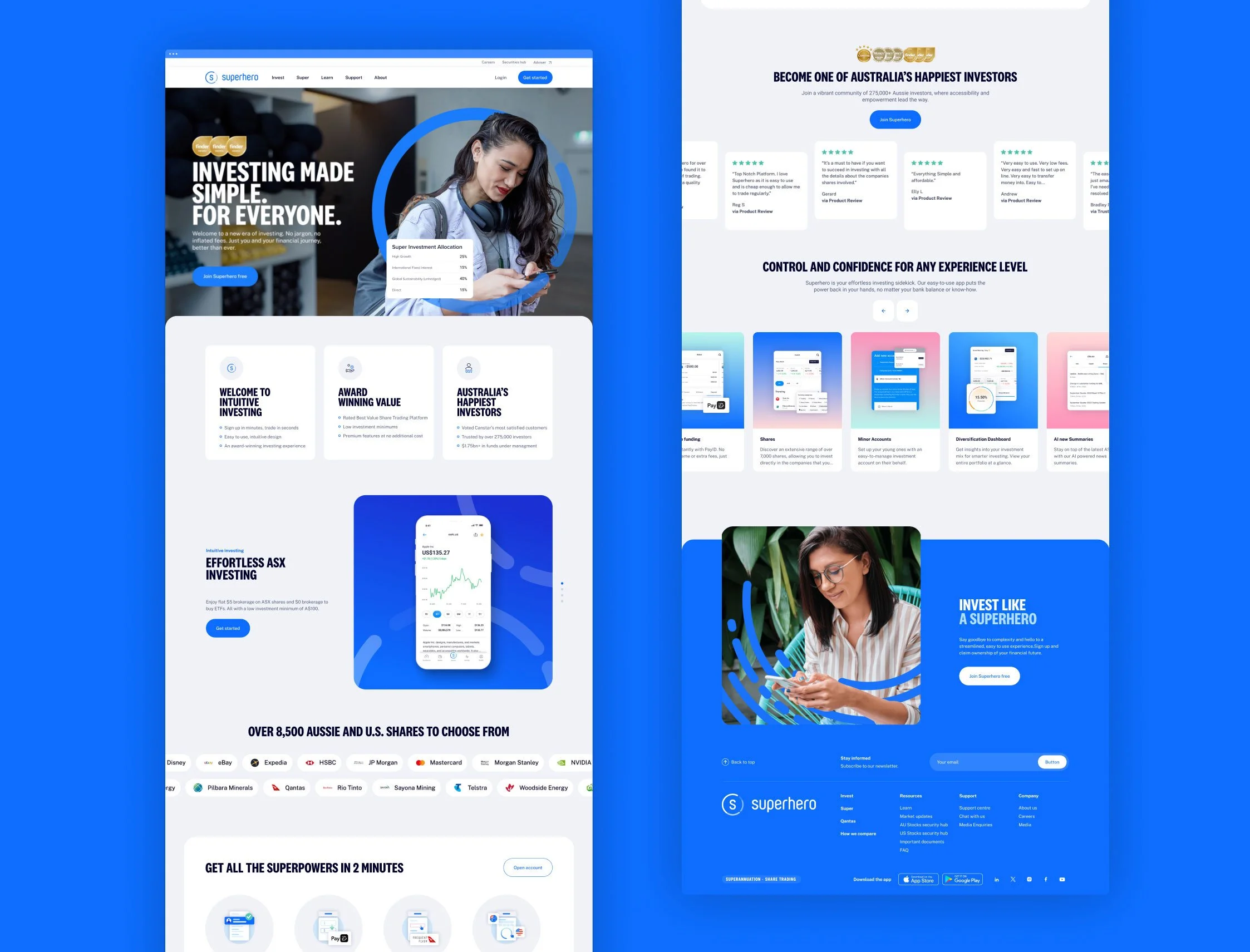
Create a new website for Superhero that integrates updated brand positioning and guidelines, fostering user confidence and empowerment through a premium, trustworthy and responsive UX and UI experience. Distinctly highlight both existing and new Superhero products while showcasing the user-friendliness of its app to increase conversion.
Process
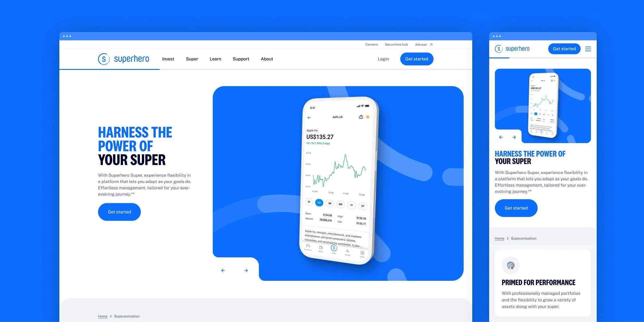
I closely collaborated with the strategist and the client on the new information architecture (IA) and navigation, adopting both a user-centric and client-centric approach. The website's structure and navigation system were redesigned to be intuitive and straightforward for existing and potential customers. Additionally, we ensured enough flexibility to make it future-proof, aligning with the client's product launch plan and accommodating future growth.
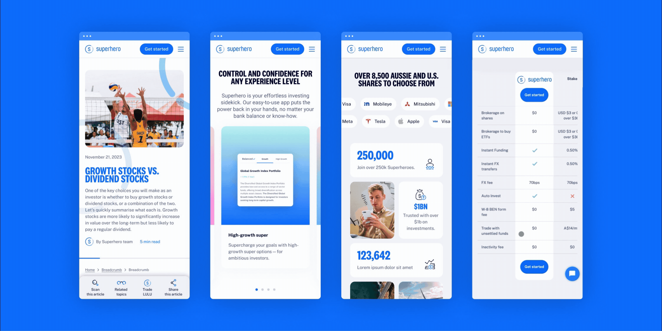
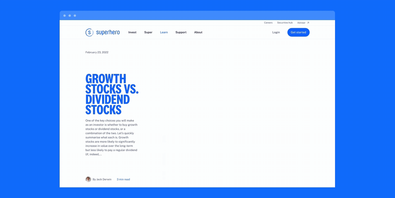
Following the strategist's collaboration with the client on the page brief skeleton, I conducted several mini workshops with the copywriter and strategist to co-create the content strategy and structure of the key pages of the website. The website is built on a modular approach but also requires bespoke pages for some product pages. We worked closely with the development team, showing them our progress regularly and discussing potential challenges which facilitated the handover and QA phases.
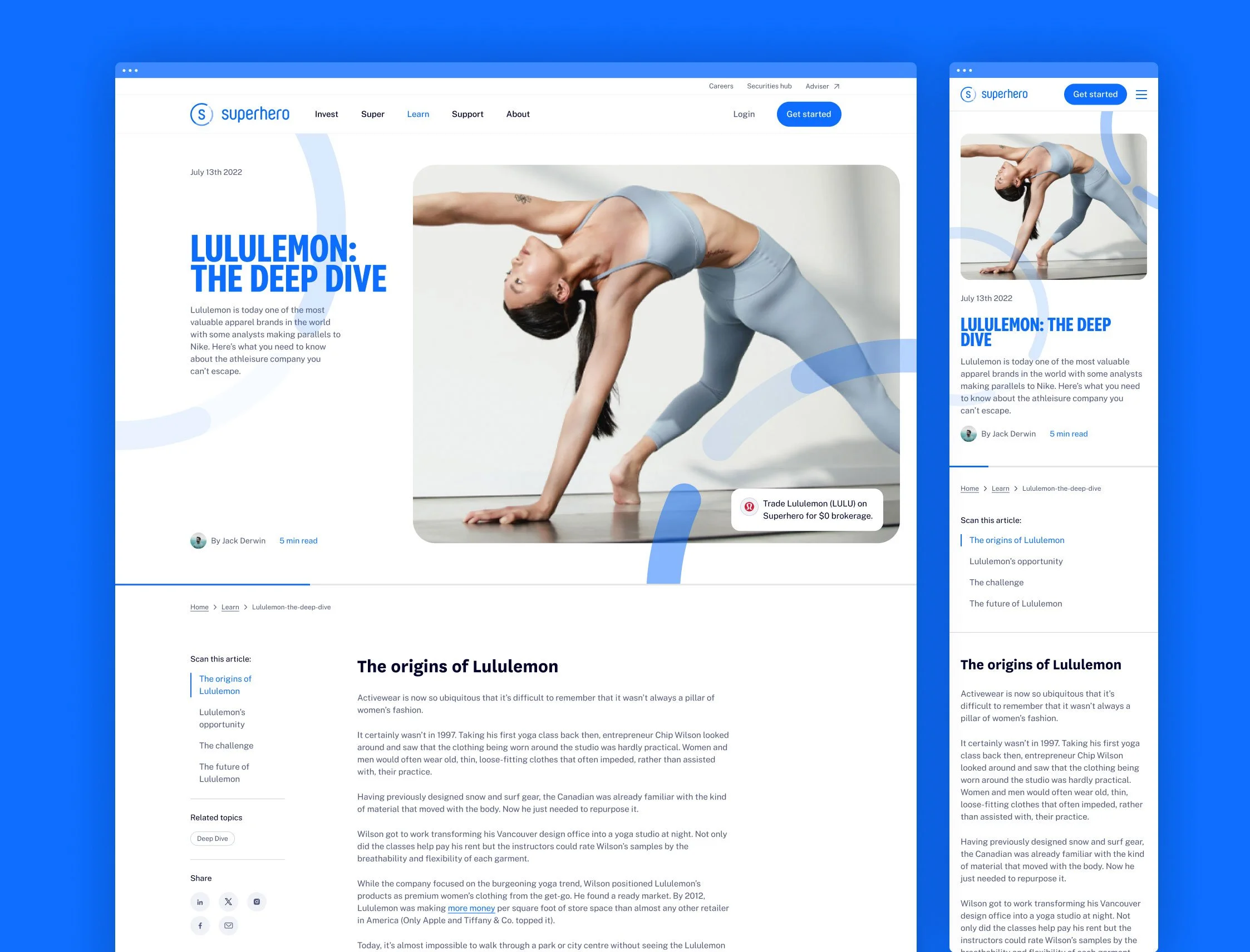
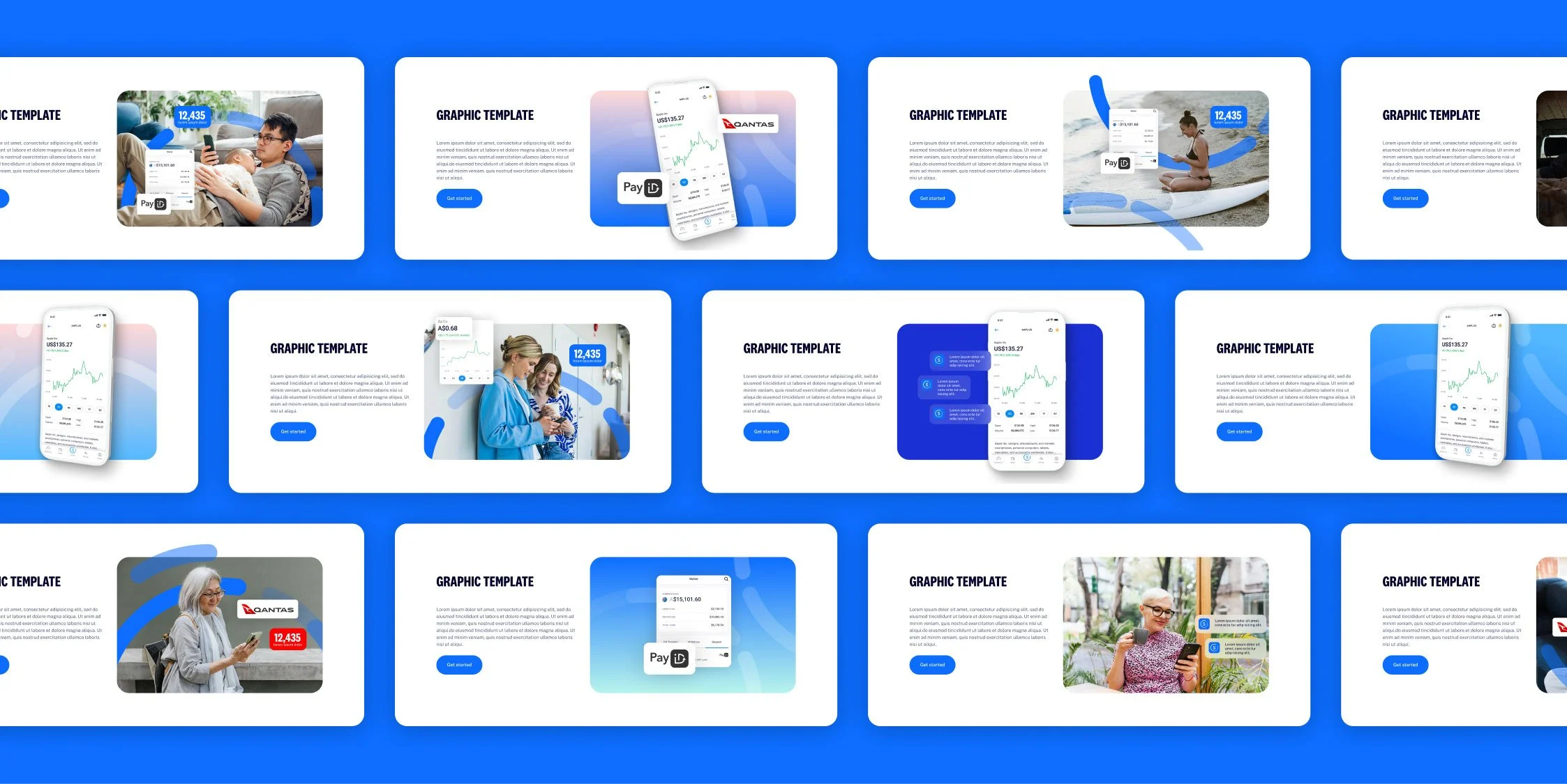
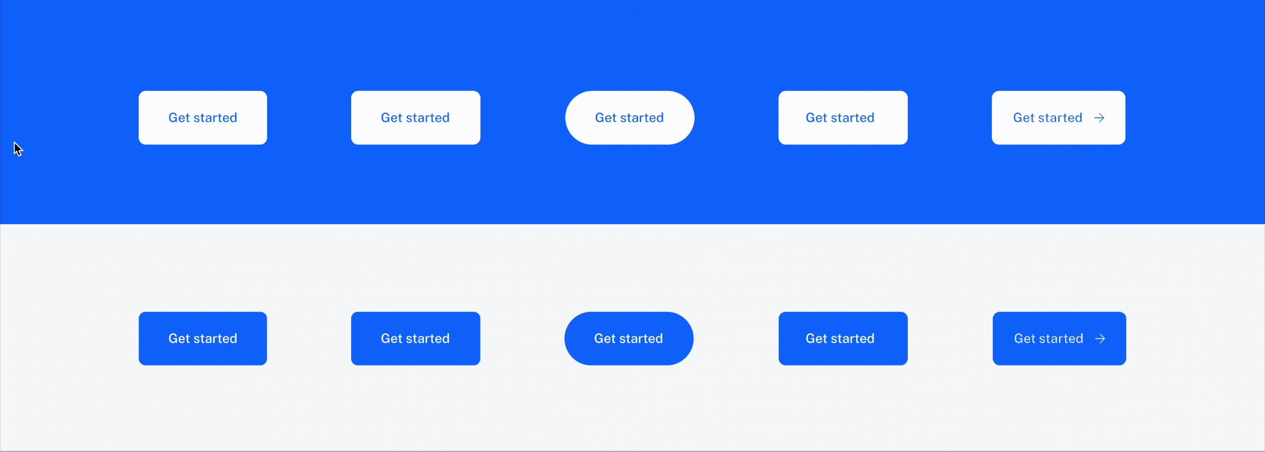
The sophisticated, humanistic and minimalist UI, not only mirrors but also showcases the contemporary clarity and simplicity of the successful Superhero app.
Supported by the new brand guidelines, I expanded the use of the updated graphic assets within the digital environment and helped develop new photography guidelines to align with both the existing and prospective audiences in trading and superannuation.
Another significant challenge for this project was the remarkably short deadline of five months. The new brand positioning, logo explorations, brand guidelines, and website had to be completed within this tight timeframe.
Running the website and rebranding efforts in parallel facilitated collaboration between the strategy team and digital/non-digital designers, fostering inspiration and creating a cohesive and efficient brand. The high level of efficiency and quality of delivery also unlocked additional scope and briefs.
Note: The rebranding phase was handled by another member of the design team with whom I collaborated to lead the website rebuild.